4th Year of Global Cooling, NOAA Says
I was reading over some discussion of the Climate Change Timeline, and realized that people are failing to notice the most important news it contains:
We are, according to NOAA, currently in our fourth year of global cooling.
This is even more significant than the 114 year cycle of taking each minor change in temperature and projecting ice ages or global warming four different times.
NOAA and NASA avoid actually saying this, because they have a lot invested in profiting from global warming…but their own data say the earth is cooling, and has been for years. I will show this below, using their own numbers, without any changes made to them. I just don’t cut it off the details in the middle of the decade, like they do. I’m too honest.
Why Stop Reporting Temperature Changes?
You’ve probably seen that scary chart they like to show, where the temperature climbs way to the top. It’s pretty much everywhere on their side.
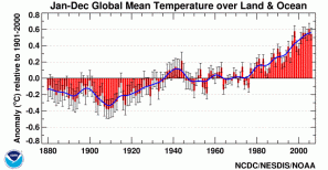
Here’s NOAA’s copy:

Notice that NOAA is still stopping their chart in 2006, although they have had data up to 2008 for a long time
Notice that its dates are very vague, and that it stops in the middle of this decade, with the very last temperature actually declining a bit. You may need to click it to see the large version.
The big problem with the chart, hidden by the vague dating, is that it ends in 2006. I have been unable to find a NOAA chart that actually includes the last two years of data.
This makes no sense, because they have data all the way up to the beginning of 2009, and have for a long time.
Here is the data that is used in that chart, on NOAA’s own site.
All you hear about, these days, is that each new year is “one of the ten warmest on record”. But that is a spin on their data…2006, 2007, and 2008 were each cooler than the year before. Why not mention this cooling trend?
The Coldest Year Since 2000
Here, on the left, is NOAA’s global mean temp for each of the past 10 years. They measure this in ten thousandths of one degree from the 100 year average:

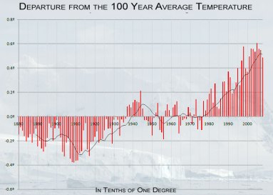
In this chart, using NOAA Climatologist data with clearer formatting, you can see that we are in a four year cooling trend, right now. Also notice that this entire chart encompasses barely more than one half of one degree. Click to zoom in for fine detail.
1998 0.5969
1999 0.4198
2000 0.3885
2001 0.5188
2002 0.5738
2003 0.5811
2004 0.5409
2005 0.6128
2006 0.5599
2007 0.5459
2008 0.4793
Blue is cooling, red is warming.
Why do those who are profiting from the global warming industry describe 2008 as one of the ten warmest years on record, instead of as the coldest year since 2000?
You can also see this, if you zoom in, on the chart at the right.
By the way, the trendline added in black is calculated from their data as an 11 year moving average, which makes sense to use just in case the sun is actually influencing temperatures on our planet. It is therefore very slow to show a reversal in trend…see how it falls behind the change in every other case. Yet it’s now showing a cooling trend, at the far right.
With the numbers on the left, you can see it is not only growing cooler, each year since 2005, but that it cooled fastest in 2008. If we graphed this trend, 0, -529, -140, -646…the curve says we should be in an actual ice age by 2020 or so. I did that last bit in my head, but if you work it out formally, send me a copy.
The Next Ice Age?

Why do we hear about unusually warm local weather, but not unusually cold? The warming of the Arctic, but not the record ice of the Antarctic? The melting of specific glaciers, but not the last two unusually cold years in the US? Unusually bad hurricane seasons, but not unusually mild ones?
By the way, don’t actually worry about that cooling trend, yet. Real scientists know that static analysis is worse than useless. You can’t just take any four data points and assume they will go on that way forever. If you do that, you end up looking as foolish as “we have 20 years until the end of civilization” crackpots Thomas Maltus and Paul Ehrlich.
On the other hand, EVERY time you have a reversal of three points in the same new direction, on the above chart, it turns out to be a reversal in the overall trend.
For example, 2005-2008 is a mirror image of 1909-1913, where the cooling had reached its peak, and the global mean was about to move toward warming.
And, overall, global cooling is worse for humanity and civilization than global warming.
Whether by coincidence or not, many failures of civilizations and economies have appeared to hinge around sudden cooling periods. There is no corresponding evidence of warming bringing down societies.
Regardless of what the actual temperature trend is, if anything, or what actually is causing it, the motivation of people who report every year the global temperature rises, but are silent every year it falls, seems worse than suspect.
These people are no more to be trusted than a tobacco scientist, and for the same reason.


